Designing MyTix Mobile app
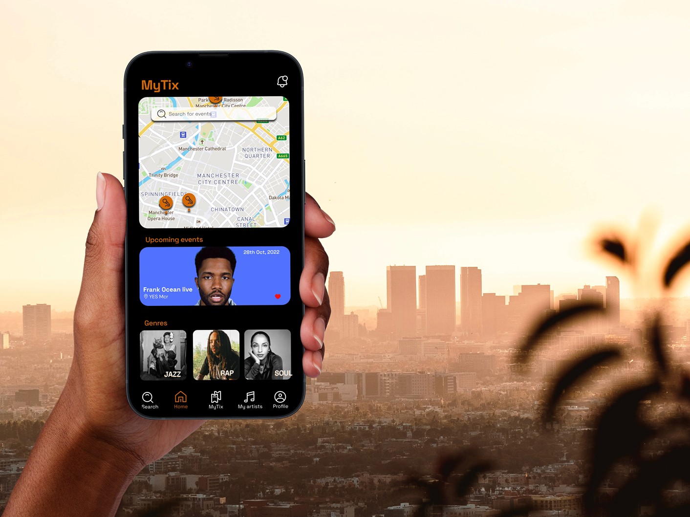
My Roles: Lead UX designer & researcher
Application: Figma
Duration: October 2022 - January 2023
Created with: Google UX course

At-A-Glance
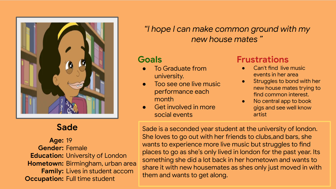
MyTix is a cutting-edge music booking app that enables users to effortlessly search for artists, live music events, and gigs in their vicinity. The app's sleek design is centered around an interactive geolocation map, which allows users to easily explore their city in search of music events. This app is specifically targeted towards 16-25 year-olds, particularly university students aged 18-23 who have recently relocated and are seeking the optimal locations to enjoy live music in their new city.
Problem
University students moving into a new city are struggling to find one central ticketing booking app for gigs and live music events that would show them the best spots to go where they could enjoy a night out, while trying to understand a new area and surroundings.
Solution
The goal is to design a central ticket booking application that enables students to easily find venues and events in their new area. The app should be simple to understand and navigate.
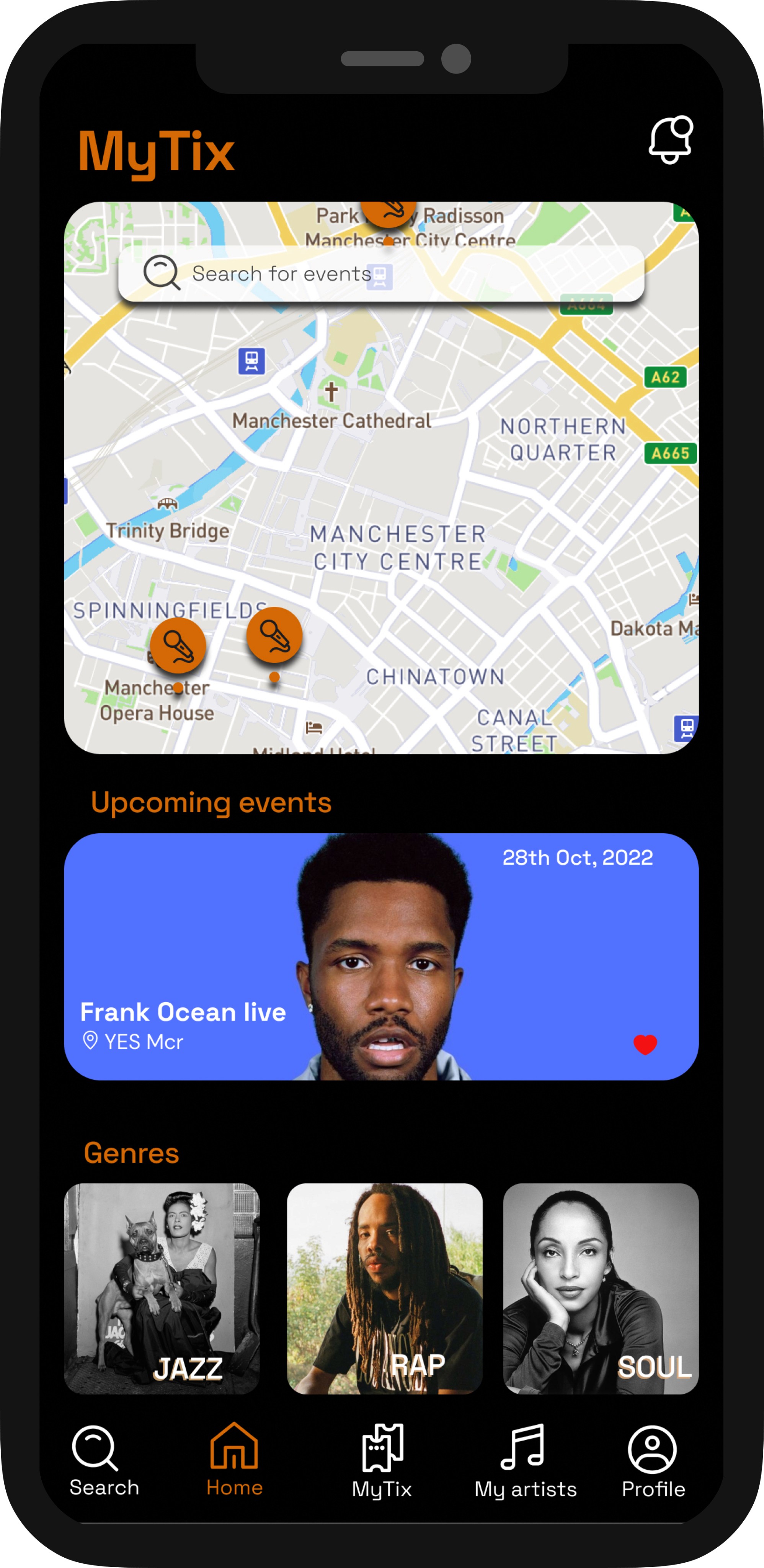
We will create a geolocation map that confidently shows users the city they are currently in, with clearly marked icons pinpointing hot spot locations for music events and gigs.
Find live gigs and music events
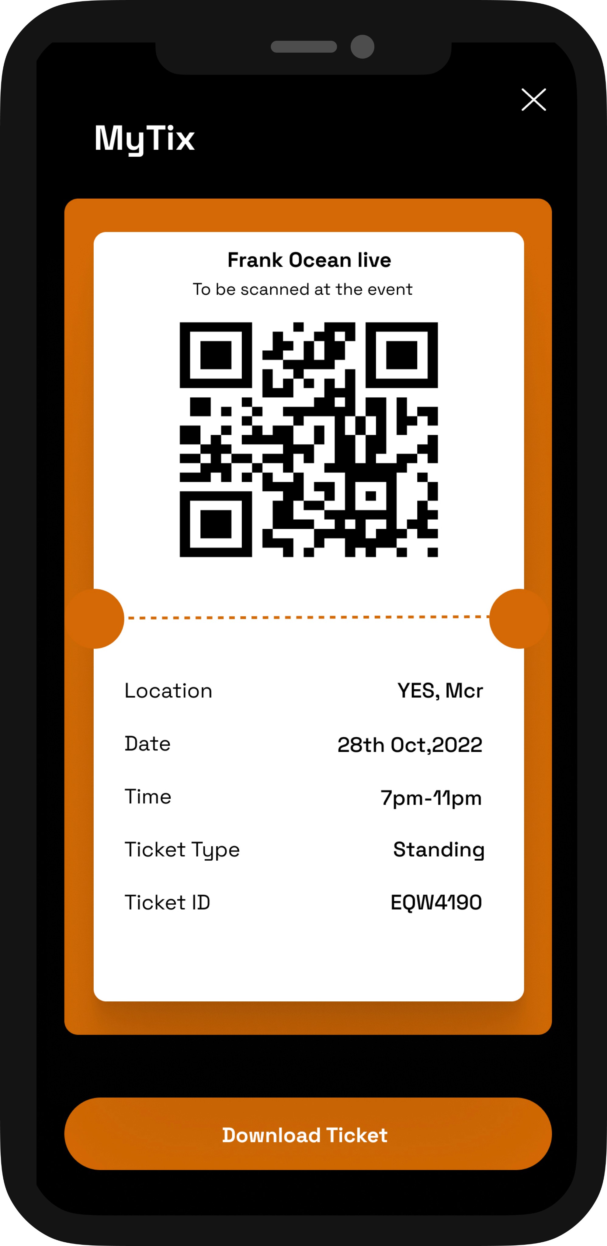
Book Tickets
Our users can effortlessly browse the app and discover exciting events to attend. With a user-friendly icon, they can easily access their tickets and book them in no time.
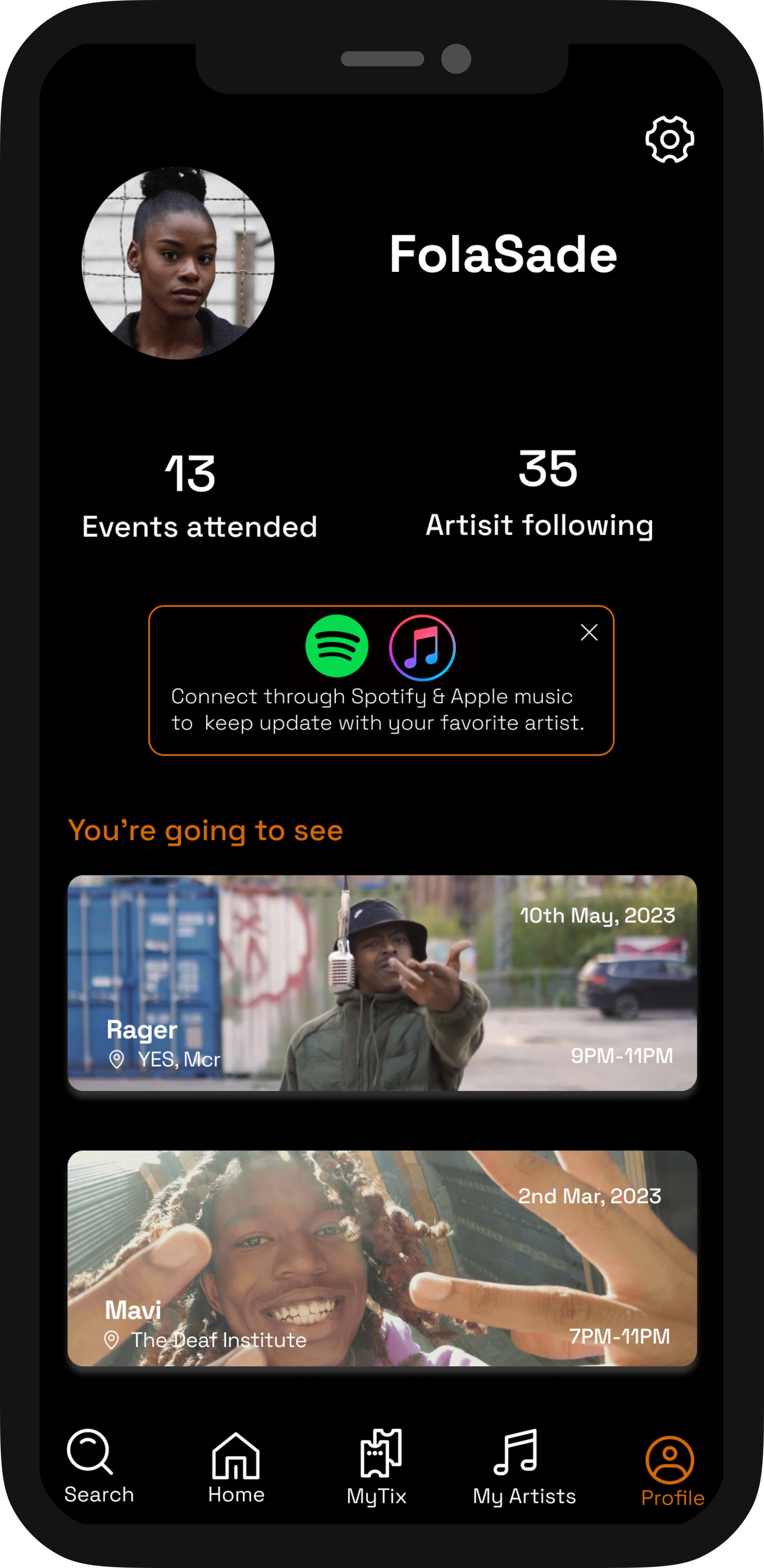
Our users will have full access to their personal profile page, which displays all their upcoming events, including the date, time, and location of each event.
Profile to view upcoming events
Process
Define
Ideate
Prototype
Test
Empathize
5 Step Design Phase


User Research
To kick off my user research, I interviewed four of my friends. I asked them a series of questions about their favorite booking apps, how they discover music events in their city, and any problems they encounter with the current apps available in the market.
What ticket booking apps do you use the most ?
How do you feel when booking tickets?
Are there any functions you would like to see in booking apps?
what problems do you currently face when booking tickets ?
How often do you go to gigs and why ?
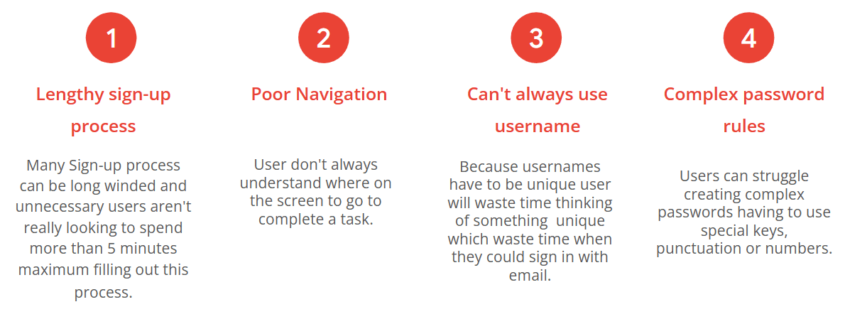
After conducting extensive interviews with various users, I was able to identify several recurring pain points that were mentioned repeatedly during these discussions. These pain points serve as valuable insights into the user experience, providing a roadmap for addressing areas of concern and improving overall satisfaction. By addressing these pain points and providing solutions that meet the needs of users, we can build a stronger, more successful product that delivers real value and meets the expectations of our audience.
Pain Points
User Persona
Information Architecture
Sketches
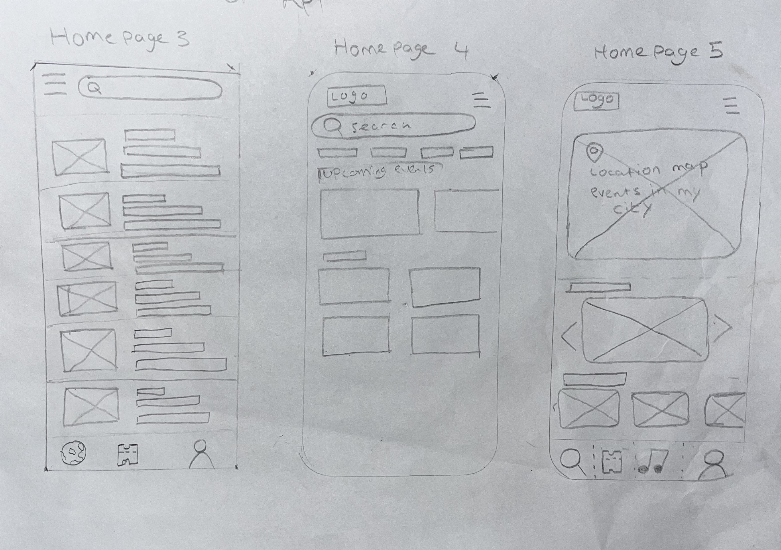
During this phase, I sketched four different layouts before blending them to create my fifth homepage which I settled on as my final homepage. Whilst sketching the screen's I thought about what people would like to see in a ticket booking app but also took inspiration from the top leading music ticket apps on the app store such as Dice, Skiddle and Fatsoma. I also took suggestions and opinions gathered from my user research.
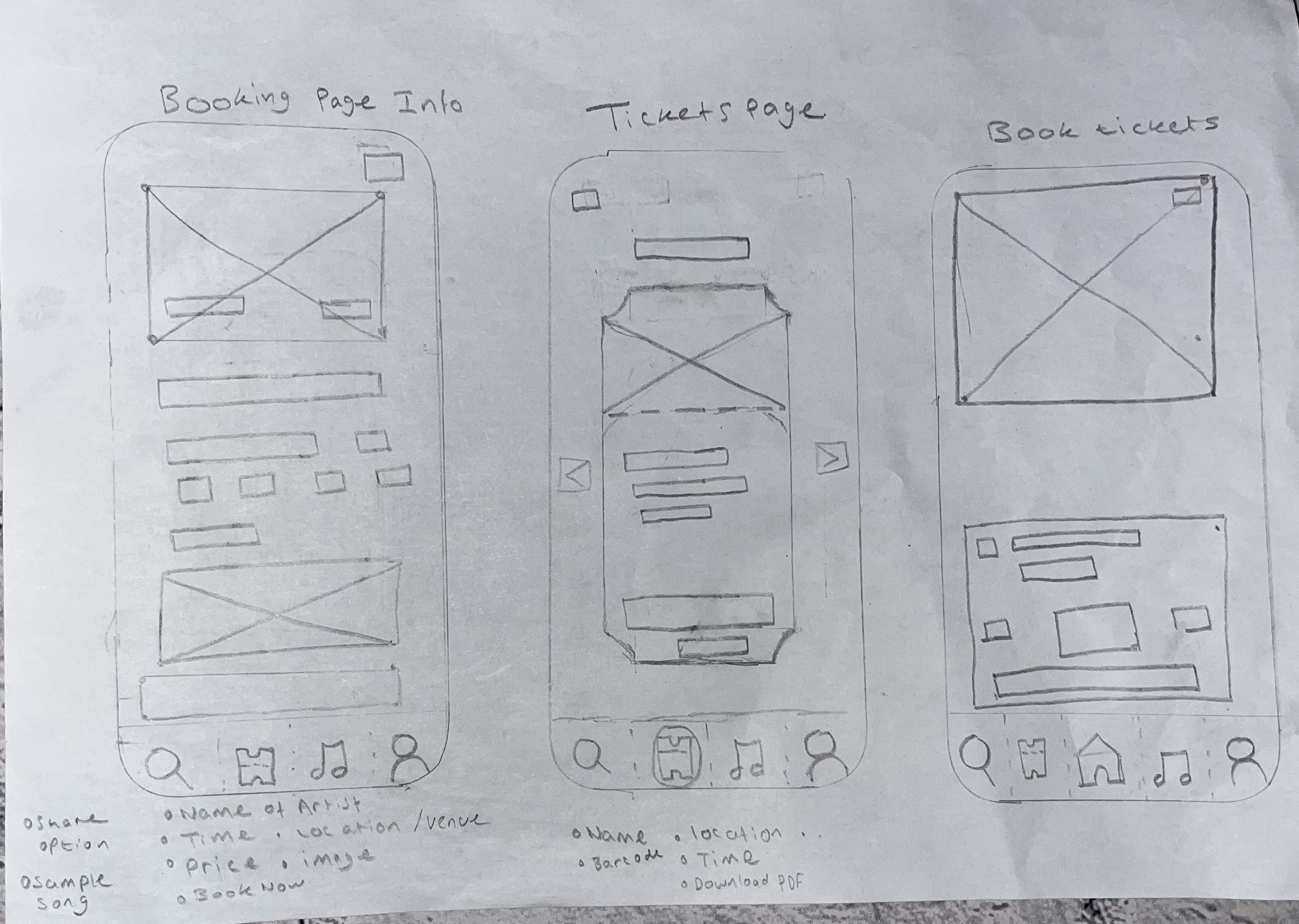
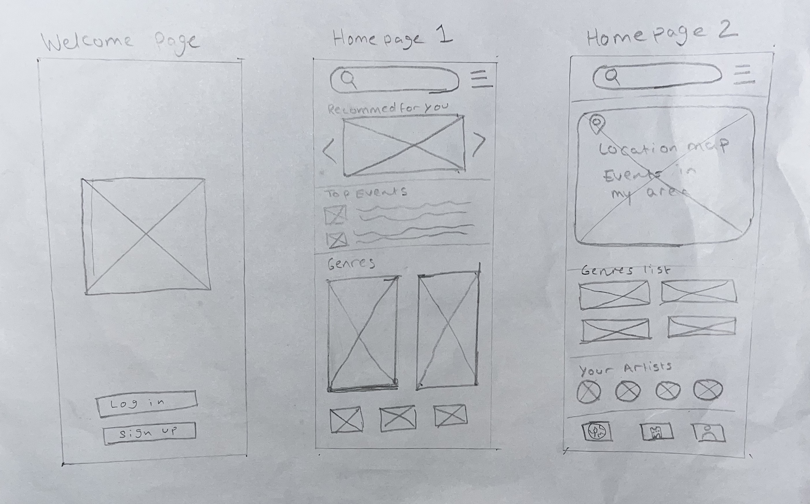
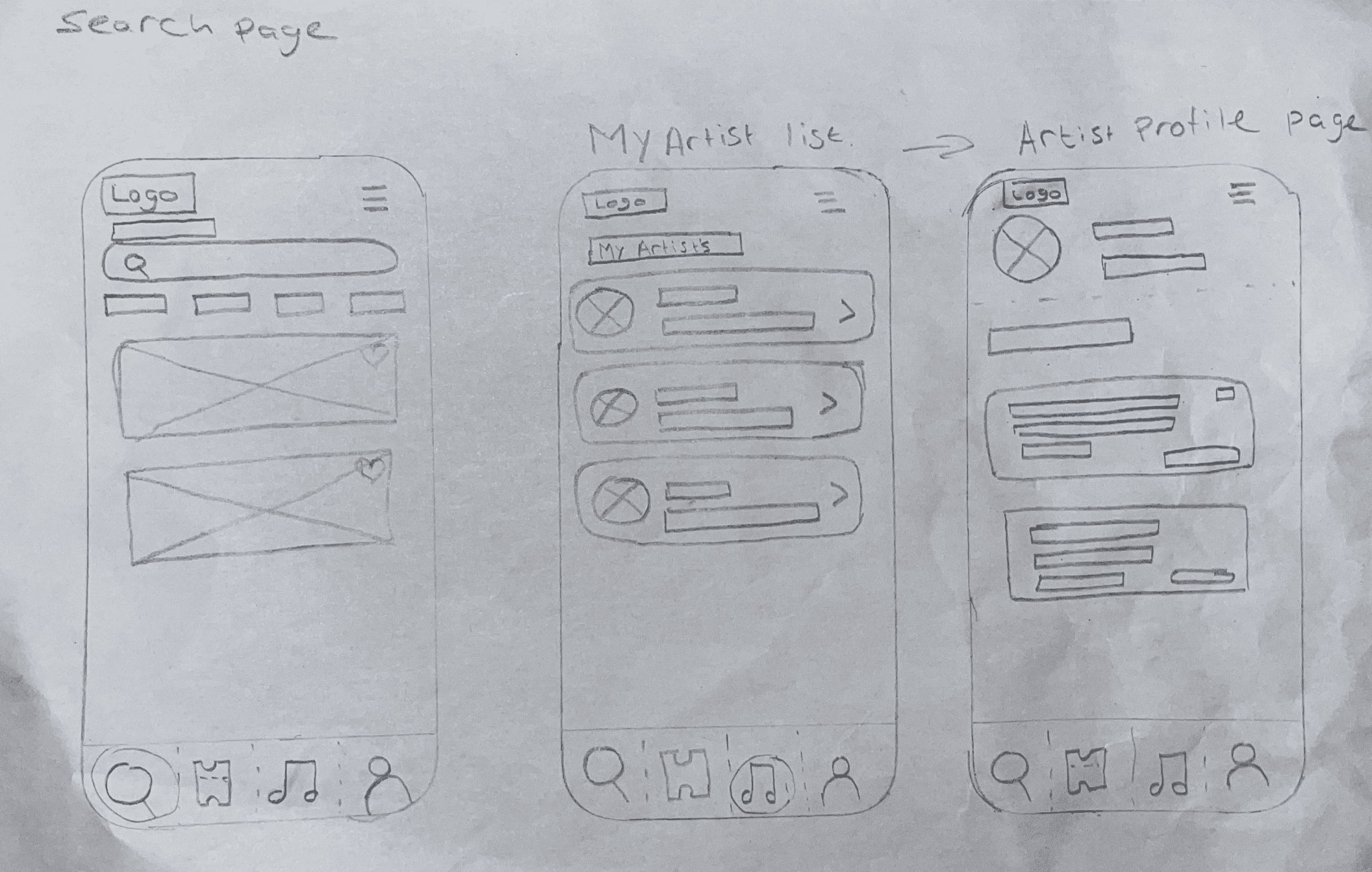
Low- Fidelity Screens
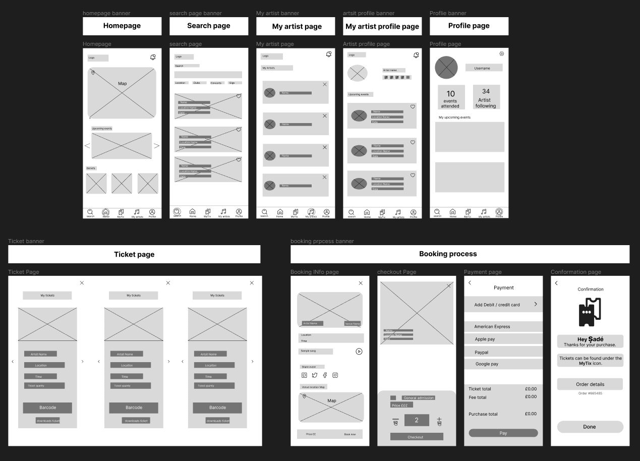
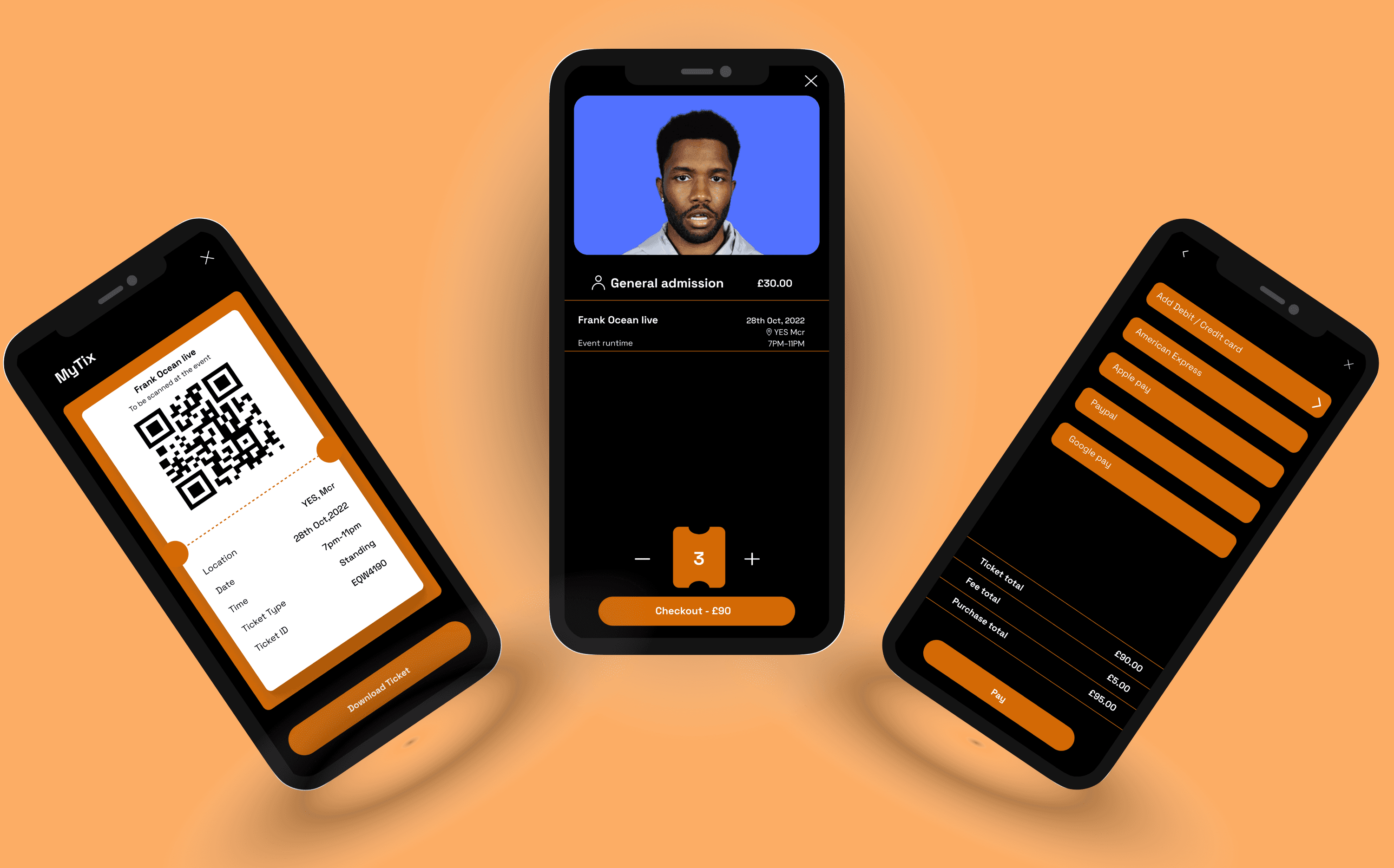
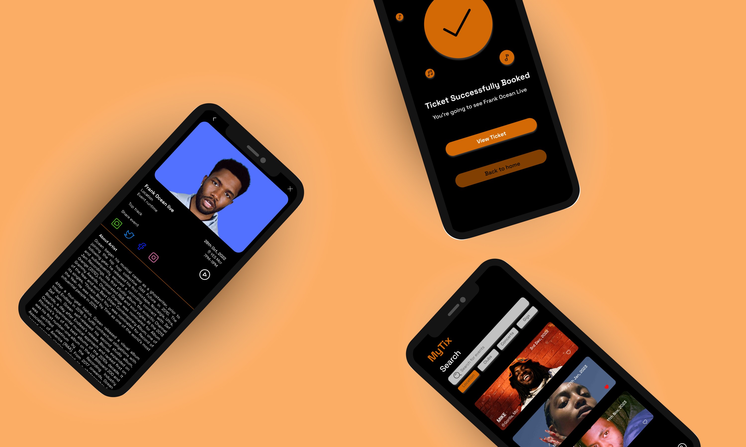
Mock-ups
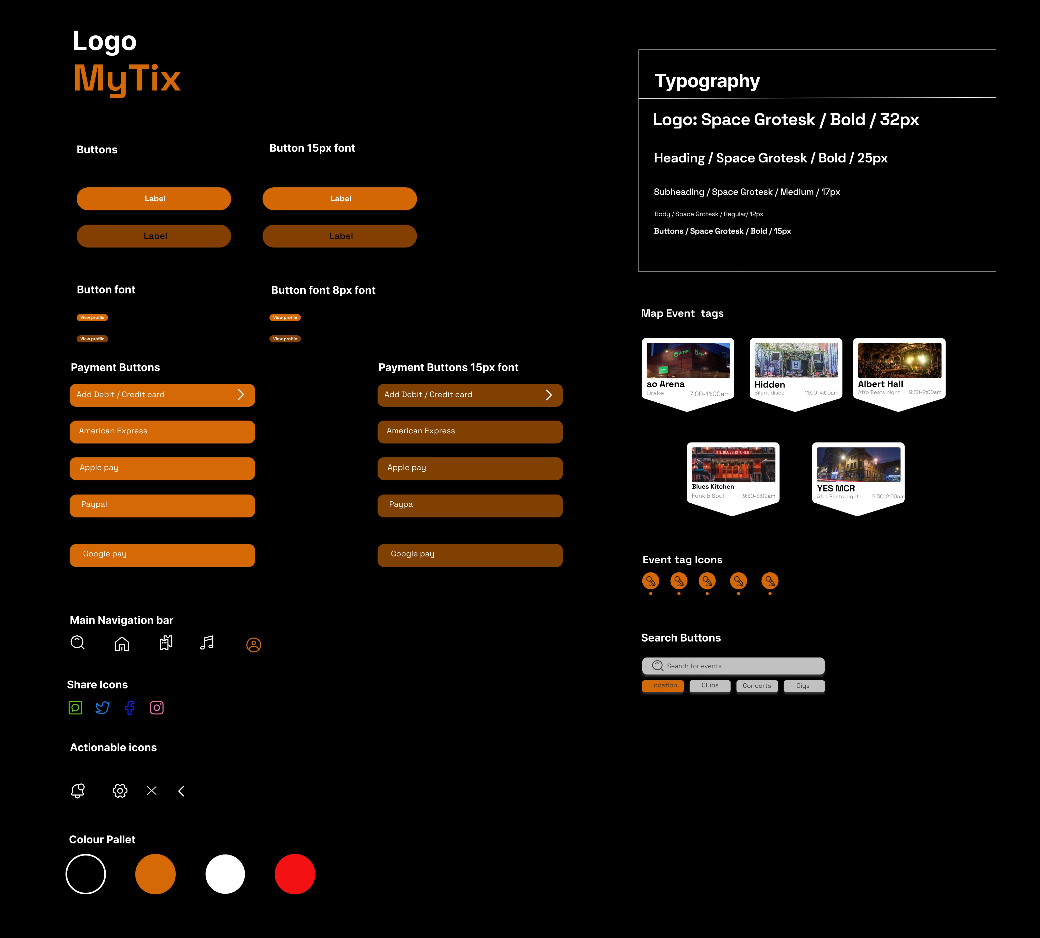
Sticker Sheet
Takeaways
Impact
MyTix gives the user a very personal feel as they navigate through the app. It's stripped back and very simple to understand allowing you to find and book events quickly, whilst also giving suggestions of places the user may want to go from the geolocation map. I feel MyTix is a great ticket-booking app that hits the target audience of allowing young students to navigate their way around a busy city to find the Top live music events within that area.
What I learned
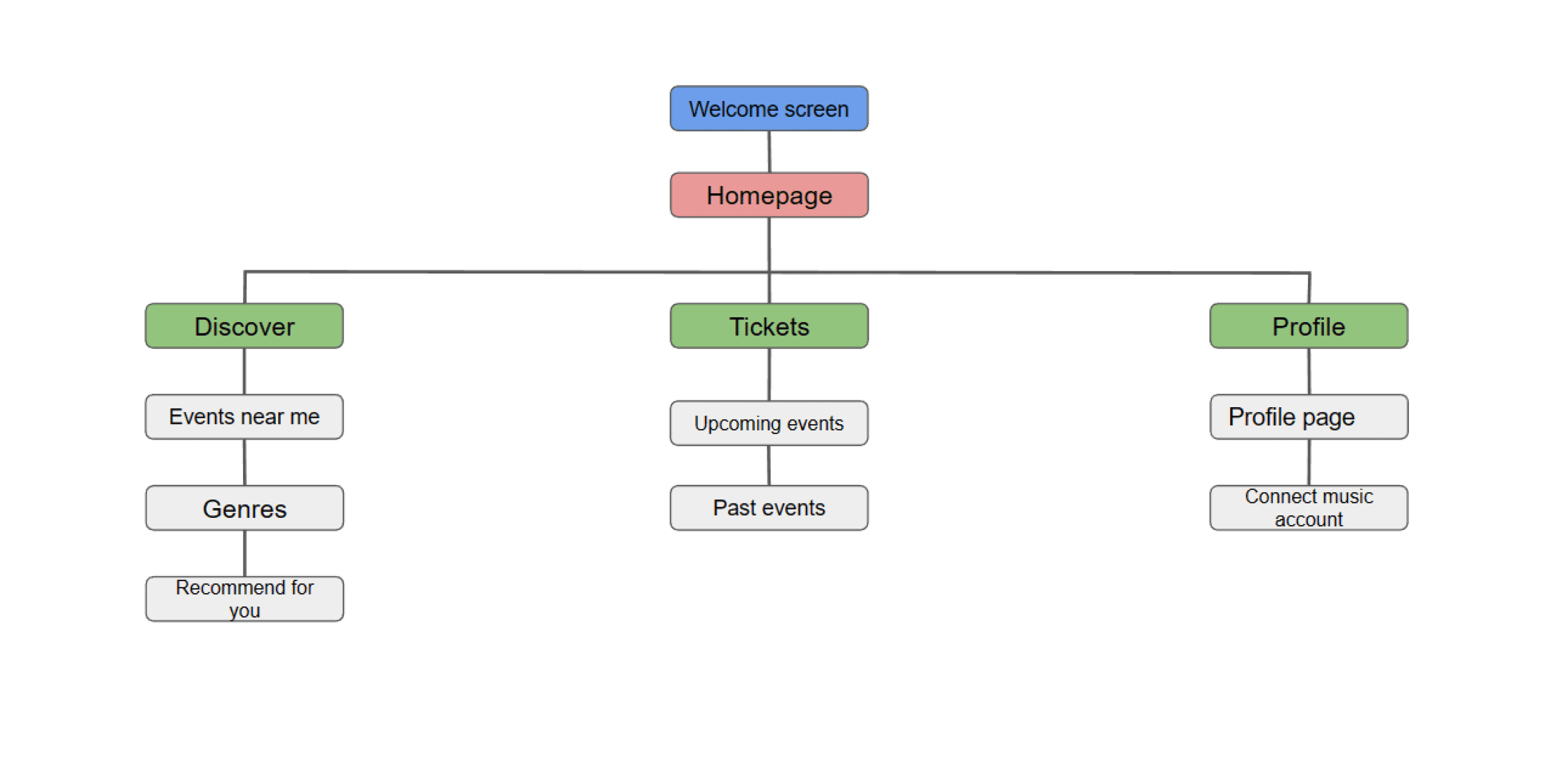
The Google UX course has been great throughout the time spent working on MyTix I have gained immense confidence in the UX space that goes beyond designing great screens. I have been able to conduct multiple UX research studies that have allowed me to get to know users of the product whilst being guided through the 5 design phases with a user-first mindset being at the forefront of any great product. I have understood the importance of information architecture allowing it to be a base for any design showing the organisation, hierarchy and sequence of a product before the initial design stages. Furthermore, I have also seen the benefits in design sprints and prototypes at all three levels paper, low-fi and high-fi which have allowed me to iterate my design and gain more user feedback at each stage. Lastly, it has pushed my skills in Figma allowing me to understand colour schemes, layouts, typography and hierarchy in the design whilst learning new tricks such as the interactive map.
Next Steps
1. With MyTix being a case study I stuck to the key screens I felt were necessary for the app. A next step would to add more screens such as a settings page were the user can add and change features within the app.
2. Another step would be getting more participants to test the app to gain more user feedback as I only had 5 people in my research study test MyTix.
3. Share my work with other UX designers and engineers to get there view and perspective of the app.
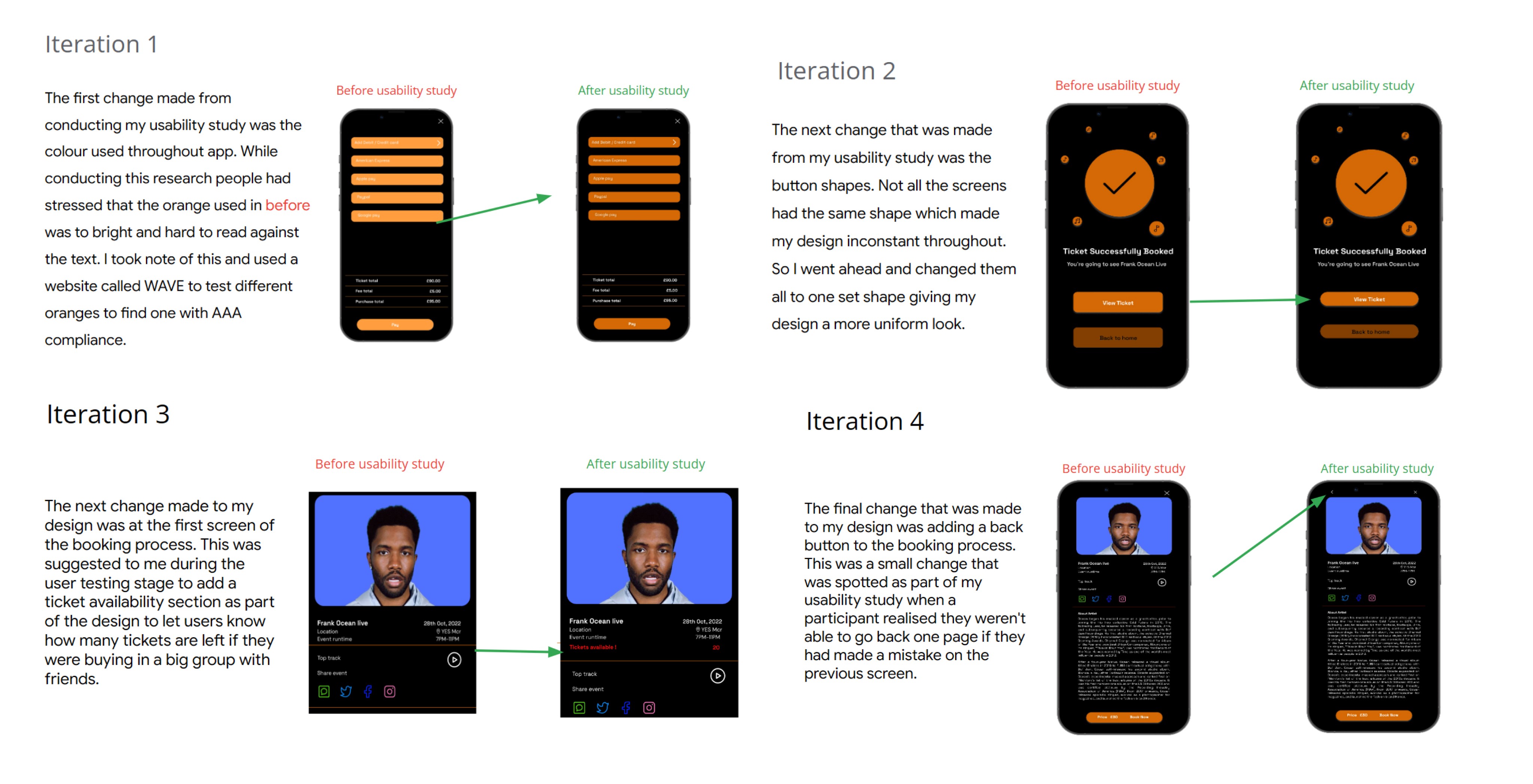
Iterations
Made by Shaqkeal Abiodun

2023

